conchiglia
Full Brand Identity / Tier 03
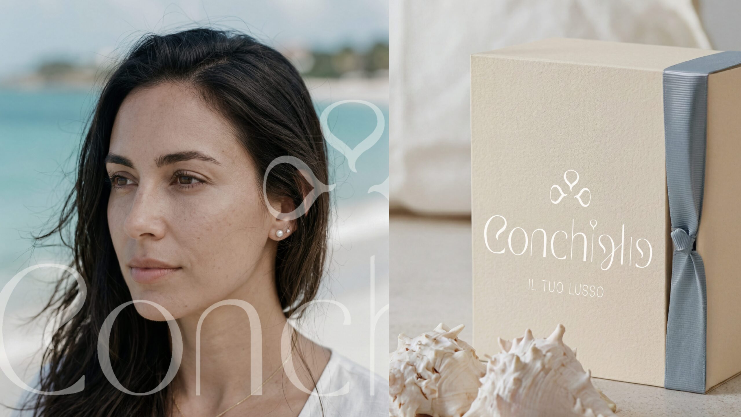
Conchiglia already had an identity, but it didn’t match the brand’s ambition. The visual language read as beach jewelry rather than a mediterranean luxury label with real craftsmanship behind it. Without a design that communicated value at first glance, the pieces were competing on price instead of feeling. Conchiglia needed an identity that let quality speak for itself.
Conchiglia
Full Brand Identity / Tier 03
Conchiglia already had an identity, but it didn’t match the brand’s ambition. The visual language read as beach jewelry rather than a mediterranean luxury label with real craftsmanship behind it. Without a design that communicated value at first glance, the pieces were competing on price instead of feeling. Conchiglia needed an identity that let quality speak for itself.
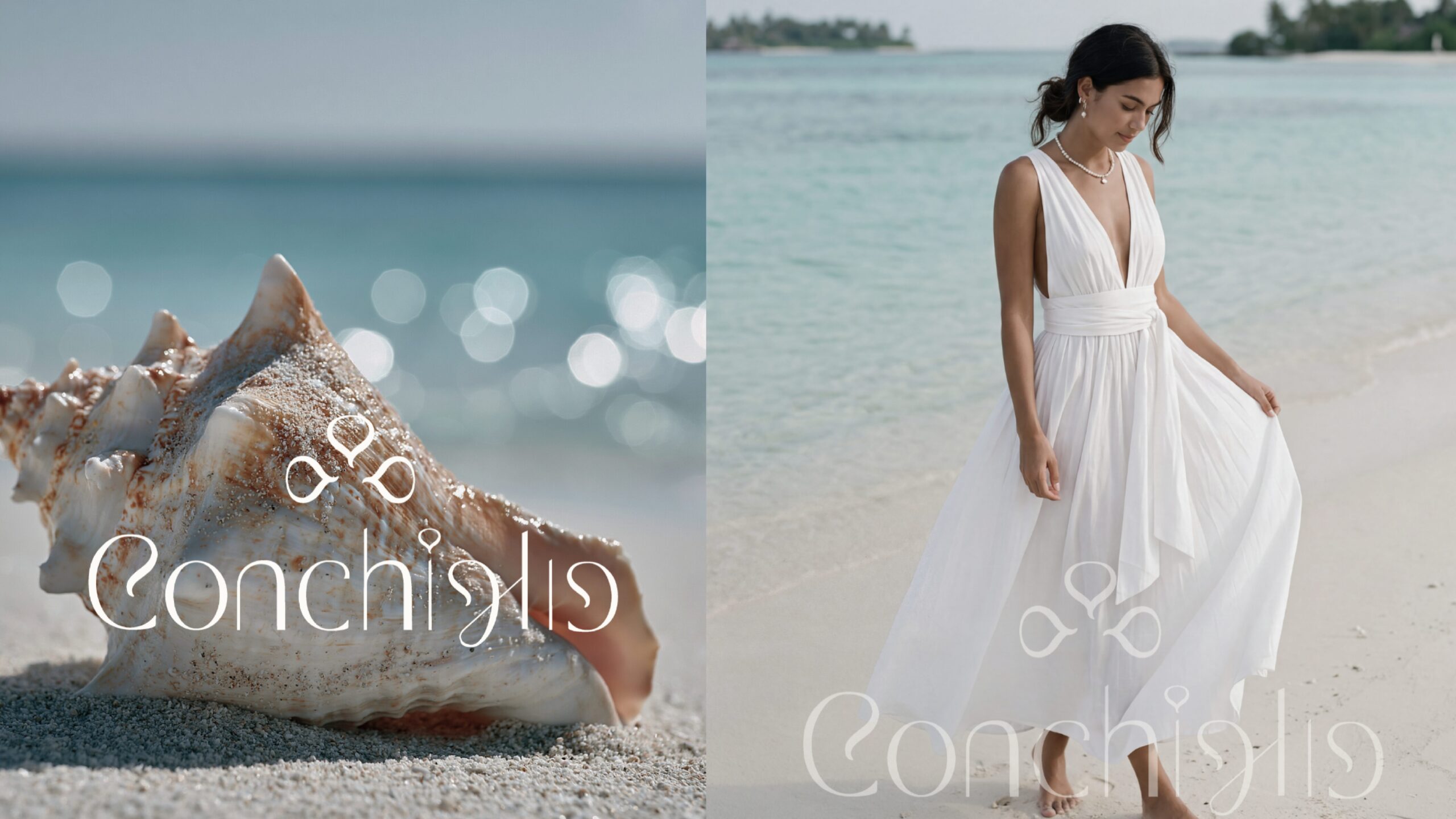
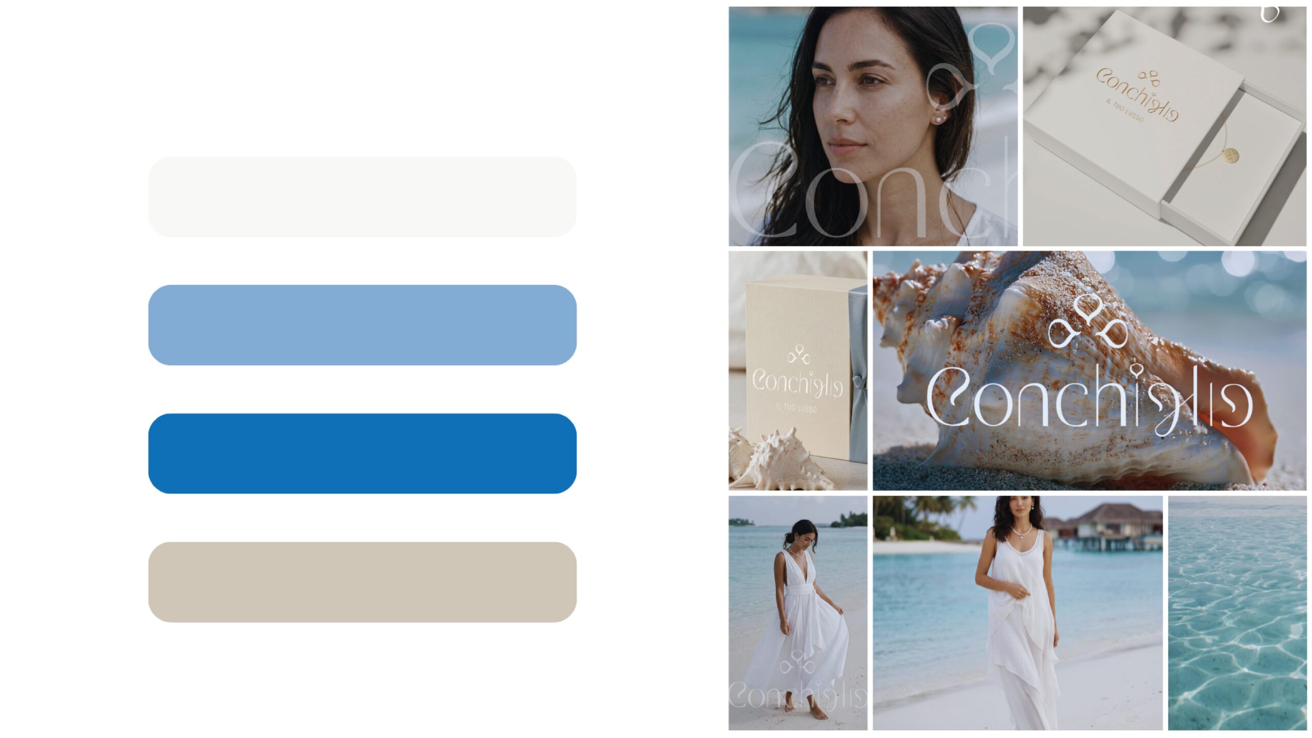
Most jewelry brands built around a shell motif lean into playful icons and pastel summer colors, a crowded, predictable space. I chose the opposite direction: treating the shell as what it truly is, a sculptural object shaped by time and water. That shift, paired with a flowing handwritten logotype, minimal cream packaging, and gold foil detailing, moved the brand away from souvenir aesthetics and toward something quieter, more personal.