
THE FAB 3
The Full Brand Identity / Tier 03
REBRANDING LEMONADE FOR A NEW GENERATION
Handcrafted, organic lemonade brands almost always look the same: soft pastels, botanical illustrations, a quiet „healthy and wholesome“ message. The Fab 3 needed to stand out in exactly that crowded space, but without giving up the organic promise that mattered to the founders. A conventional, heritage-driven look wouldn’t reach the audience they wanted: younger people who care about quality and taste, not just „natural.The real problem wasn’t the product, the lemonade itself was excellent, it was that the category’s visual language made „organic“ synonymous with „boring,“ and that was holding the brand back from the fun, energetic image it deserved.
The Yellow Poppy
Full Brand Identity / Tier 03
REBRANDING LEMONADE FOR A NEW GENERATION
Handcrafted, organic lemonade brands almost always look the same: soft pastels, botanical illustrations, a quiet „healthy and wholesome“ message. The Fab 3 needed to stand out in exactly that crowded space, but without giving up the organic promise that mattered to the founders. A conventional, heritage-driven look wouldn’t reach the audience they wanted: younger people who care about quality and taste, not just „natural.The real problem wasn’t the product, the lemonade itself was excellent, it was that the category’s visual language made „organic“ synonymous with „boring,“ and that was holding the brand back from the fun, energetic image it deserved.
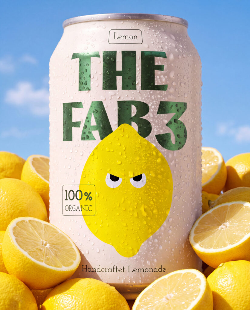
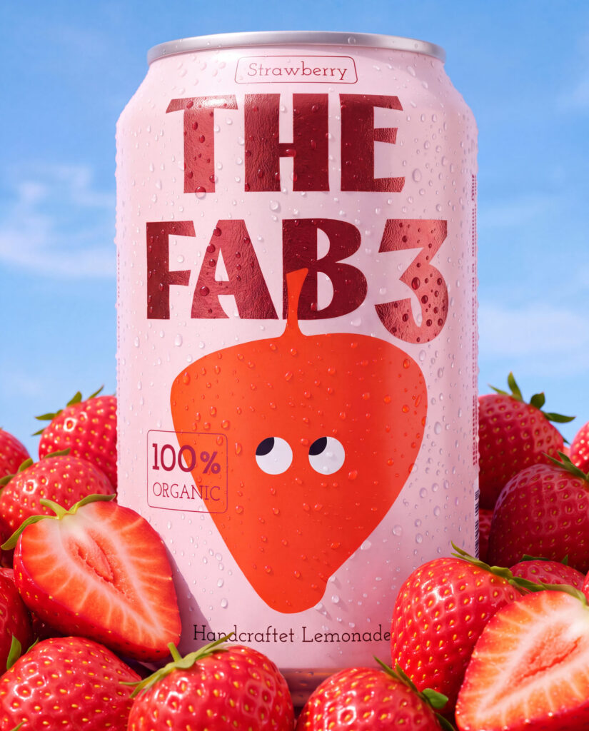
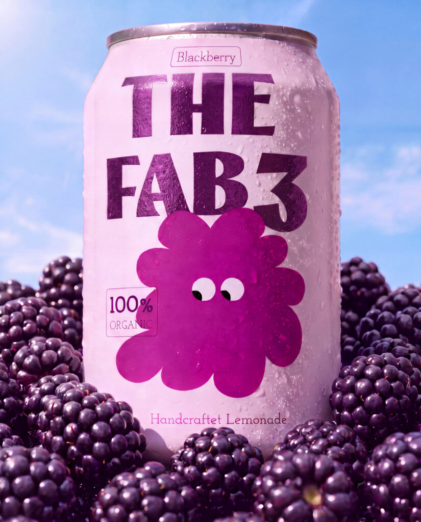
Special edition with metallic foil effect.
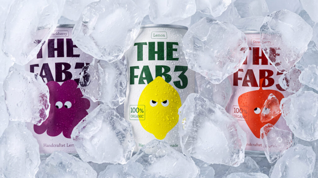
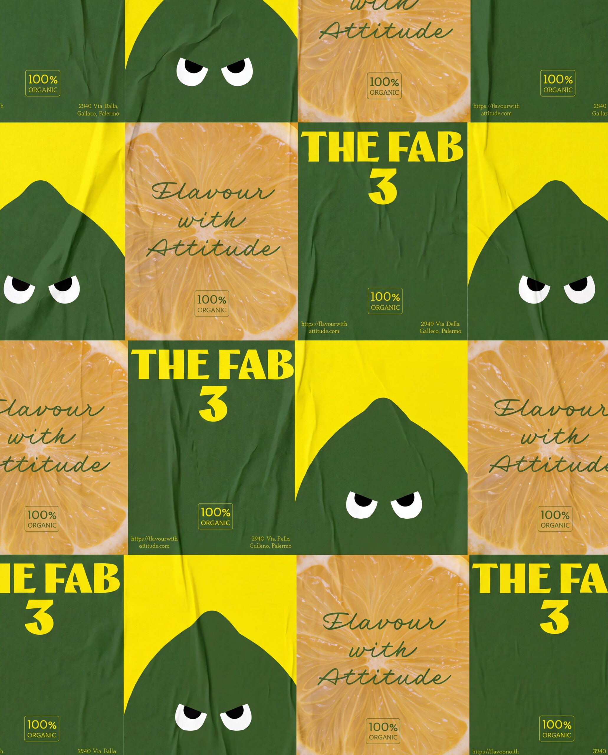
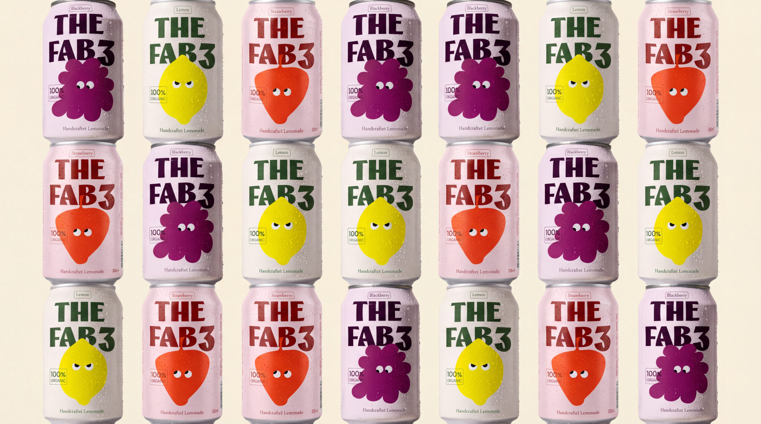
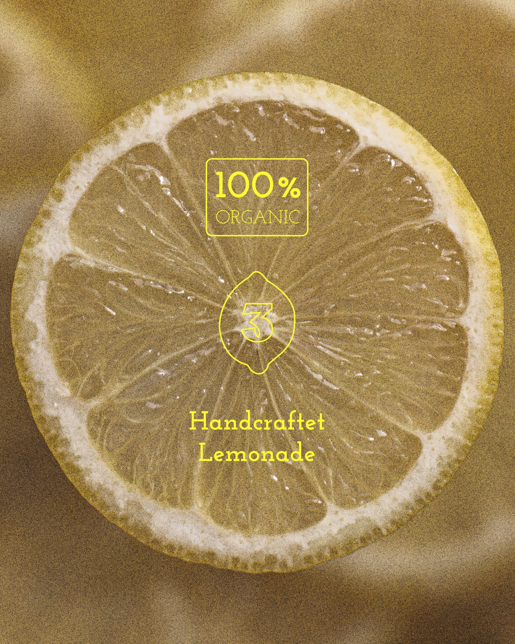
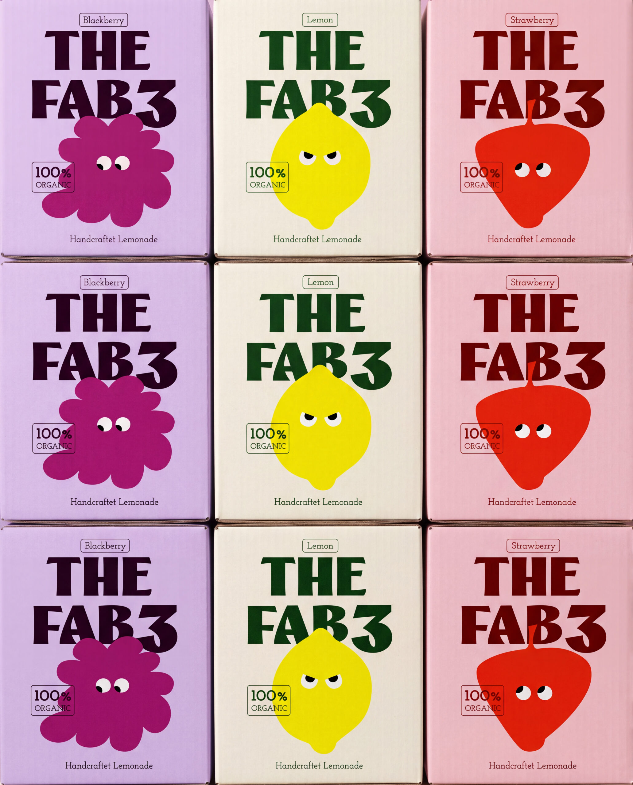
Instead of researching heritage and provenance, the usual starting point for this category, I looked at where handcrafted drink brands were failing to connect: they all spoke to the same audience with the same tone. That gap became the direction. If everyone else leans into calm and nature, personality becomes the differentiator. So each of the three flavors, lemon, strawberry, and blackberry, got its own illustrated character with a distinct expression and attitude: the lemon sharp and a little suspicious, the strawberry playful and wide-eyed, the blackberry bold and unbothered. Photographed fresh, dewy, and surrounded by real fruit against a blue sky, the cans read as vibrant and alive rather than clinical. The typography follows the same logic: a bold, condensed display type for „THE FAB 3“ carries the attitude, while a clean supporting slab typeface keeps things legible and grounded.
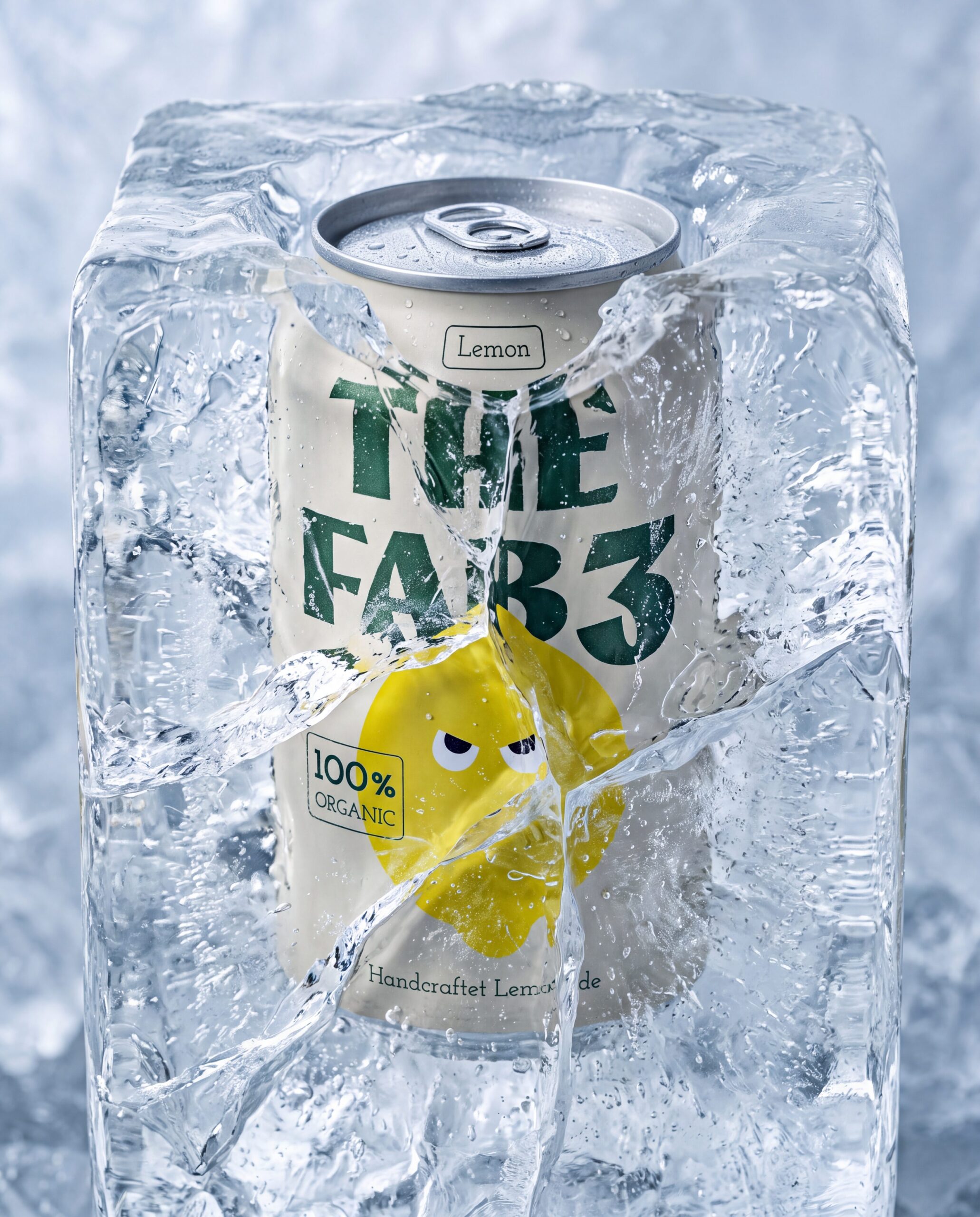
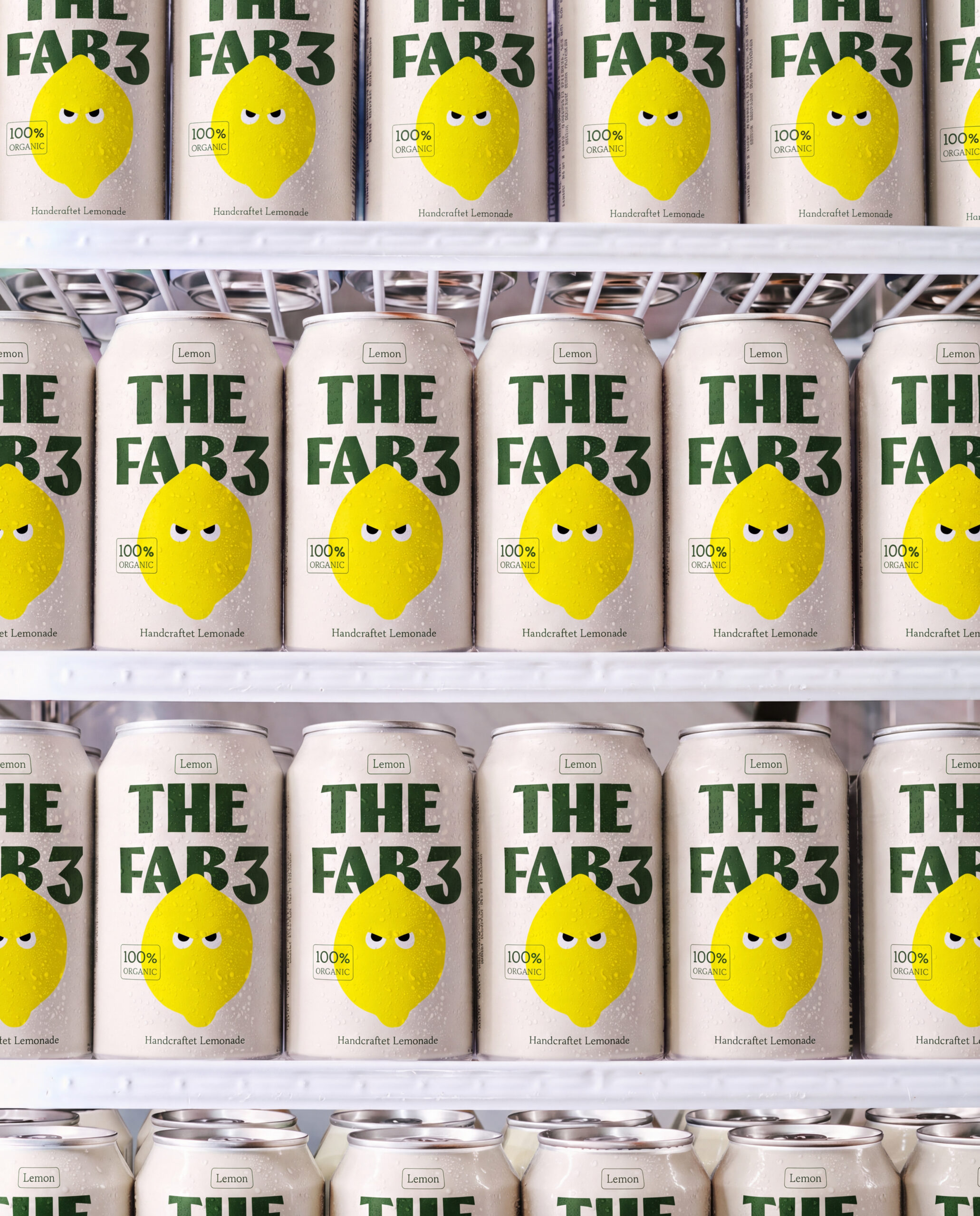
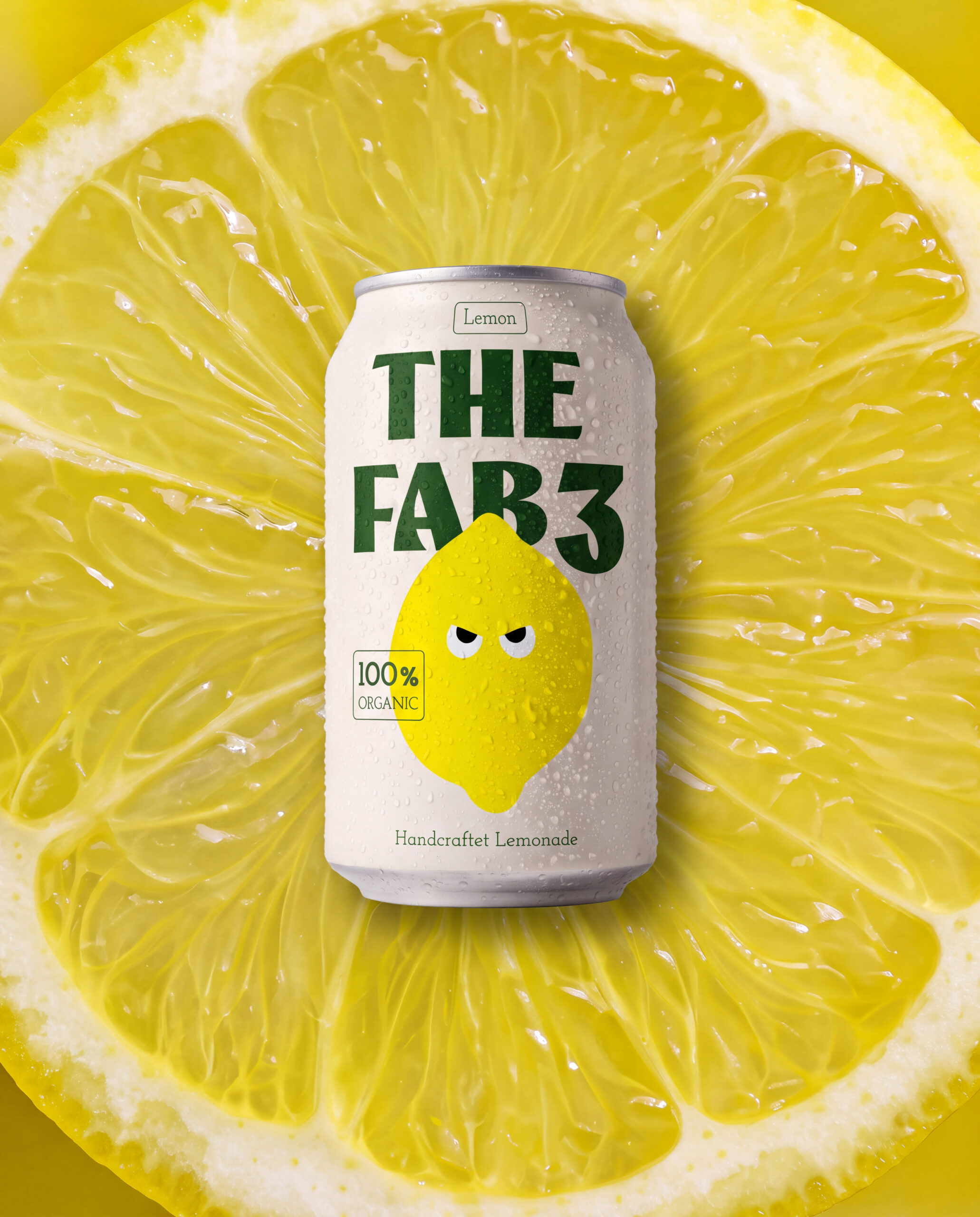
I don’t think „organic“ and „fun“ should be opposites, but most brands in this space treat them that way, defaulting to minimalism because it reads as premium and trustworthy. What I look for is where a category’s unwritten rules are actually just habits, not requirements. Here, the assumption was that health-conscious products need a calm, restrained visual language. I challenged that by asking what would happen if the product had a personality of its own, literally a face and an attitude.