
BOTANICAL COSMETICS
full Visual Identity / Tier 02
REBRANDING AND PACKAGING
Natural cosmetics is a saturated market, and most brands in it look nearly identical: minimalistic, soft, muted. That look attracts a specific, already-converted audience, but it does little to reach anyone outside it. The brand wanted to grow beyond the typical natural-cosmetics buyer and reach people who care first about quality and impact, not necessarily about „natural“ as a category. The old approach was holding them back because it blended into a sea of near-identical packaging instead of standing out, and it spoke only to an audience that already knew what they wanted, rather than winning new customers over.
Botanical cosmetics
Full Visual Identity / Tier 02
REBRANDING AND PACKAGING
Natural cosmetics is a saturated market, and most brands in it look nearly identical: minimalistic, soft, muted. That look attracts a specific, already-converted audience, but it does little to reach anyone outside it. The brand wanted to grow beyond the typical natural-cosmetics buyer and reach people who care first about quality and impact, not necessarily about „natural“ as a category. The old approach was holding them back because it blended into a sea of near-identical packaging instead of standing out, and it spoke only to an audience that already knew what they wanted, rather than winning new customers over.
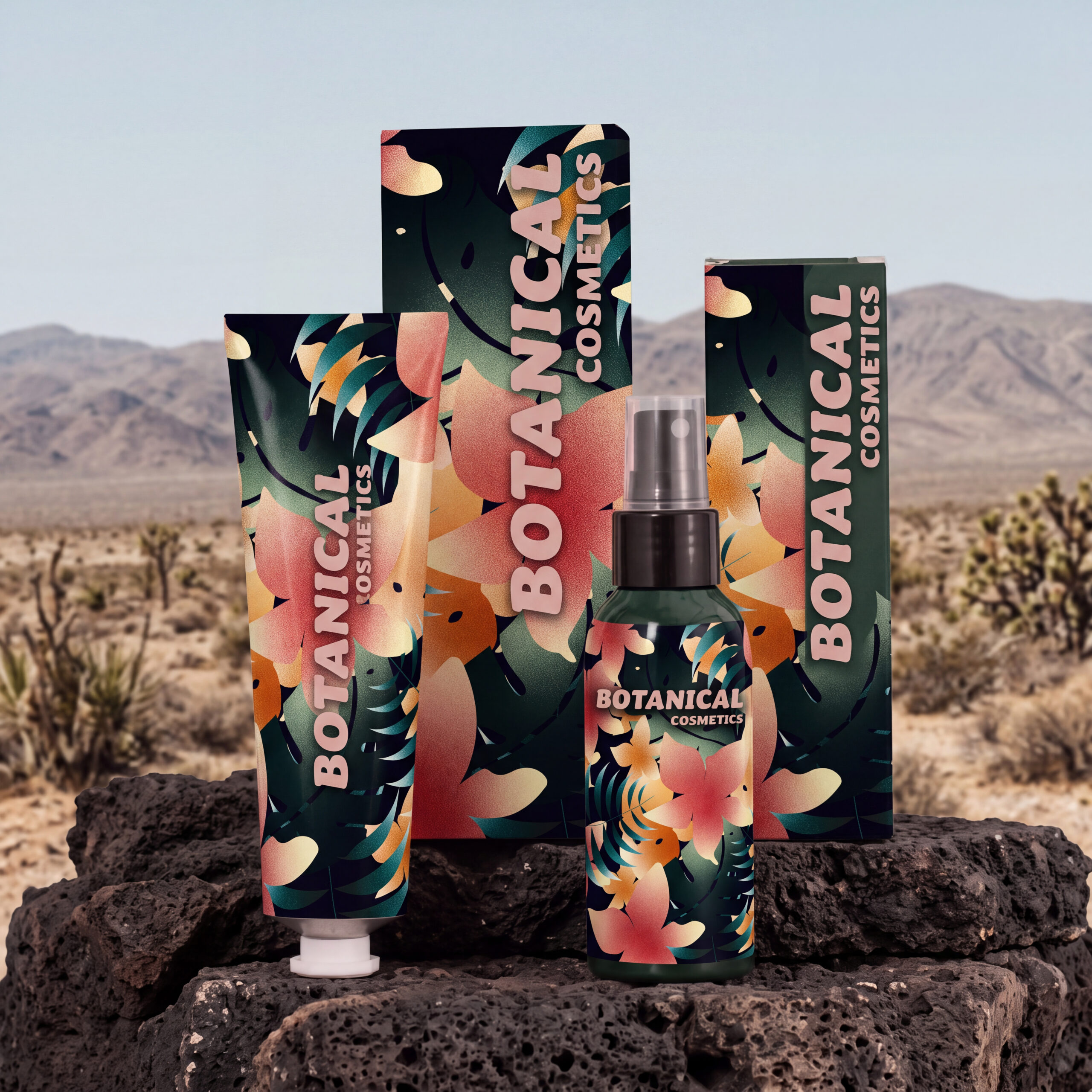
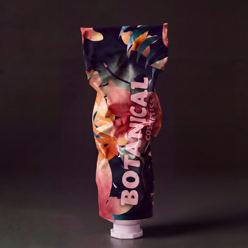
What the brand really wanted to convey was liveliness, passion, and power. That gap between what the brand needed to say and what the category typically looks like became the creative direction. Instead of following the soft, pared-back convention, I created a colorful, artistic jungle pattern that expresses energy and boldness at first glance. For the wordmark, a condensed, expressive display type for „BOTANICAL“ carries that bold, organic character, while a clean supporting typeface for „COSMETICS“ adds structure and keeps the identity contemporary without competing with the botanical lettering. The palette followed the same logic: deep evergreen and midnight navy for richness and grounding, soft peach and coral for warmth, creamy butter tones for a natural feel, and a dusty blush accent for a refined, modern touch, together striking a balance between wild nature and sophisticated beauty, while staying flexible enough to grow across the full range.
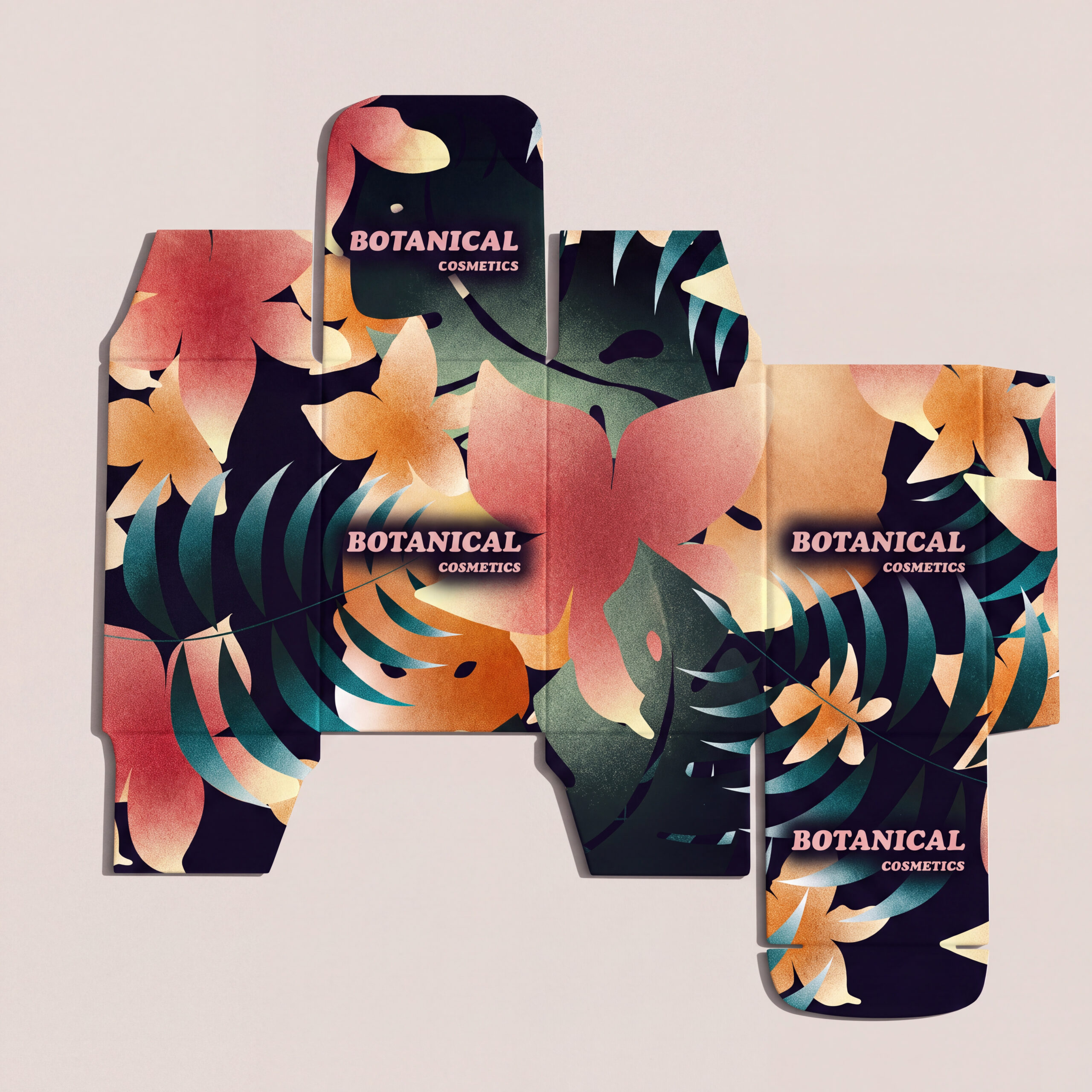
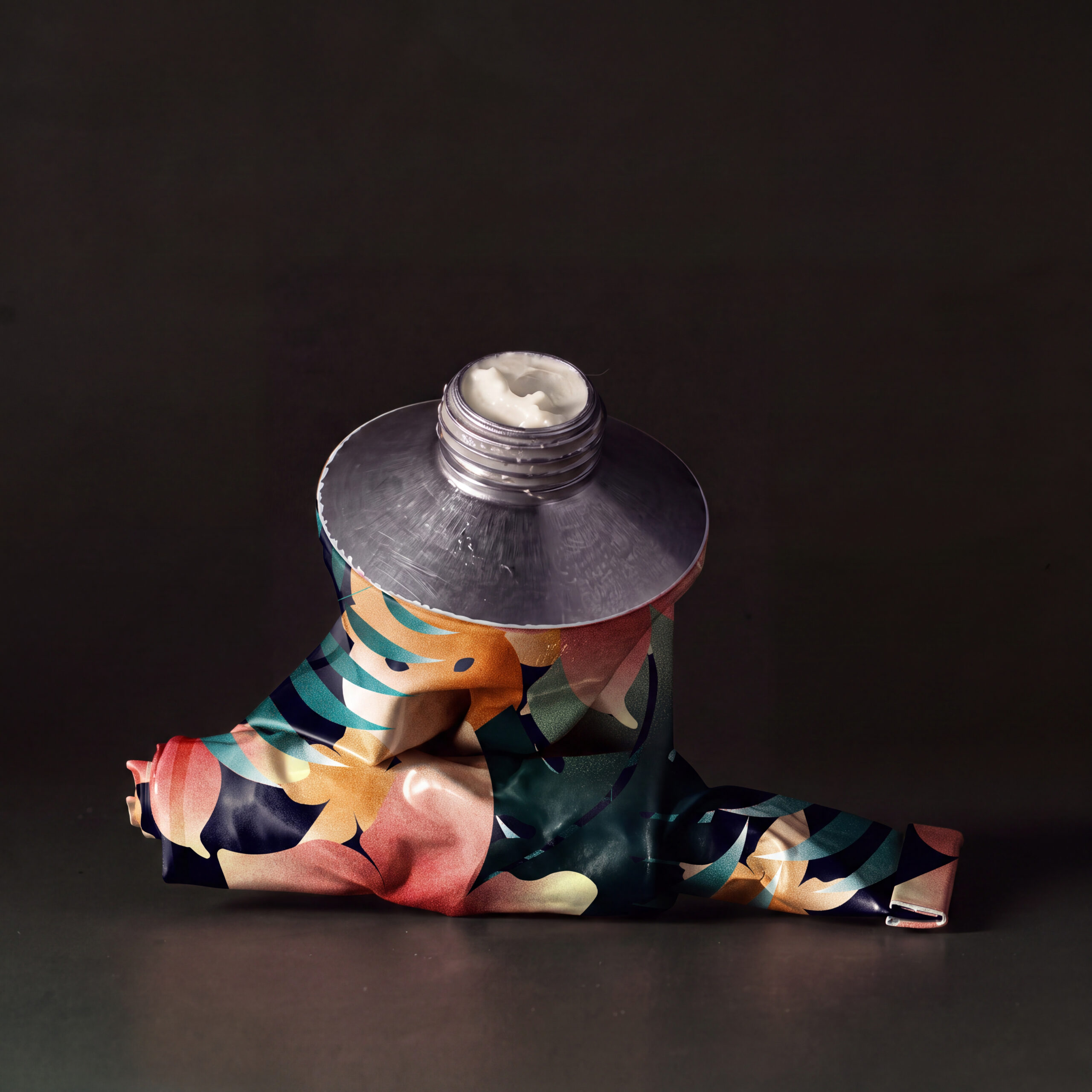
Most brands in this category default to soft and minimal because that’s what „natural“ has come to mean visually, but that’s a convention, not a rule. I look for the gap between what a brand’s product actually feels like and what its category expects it to look like. Here, that gap was liveliness versus quiet restraint, and closing it, rather than following the expected path, is what makes a brand stand out instead of blending in.