breaker
Full Visual Identity / Tier 02
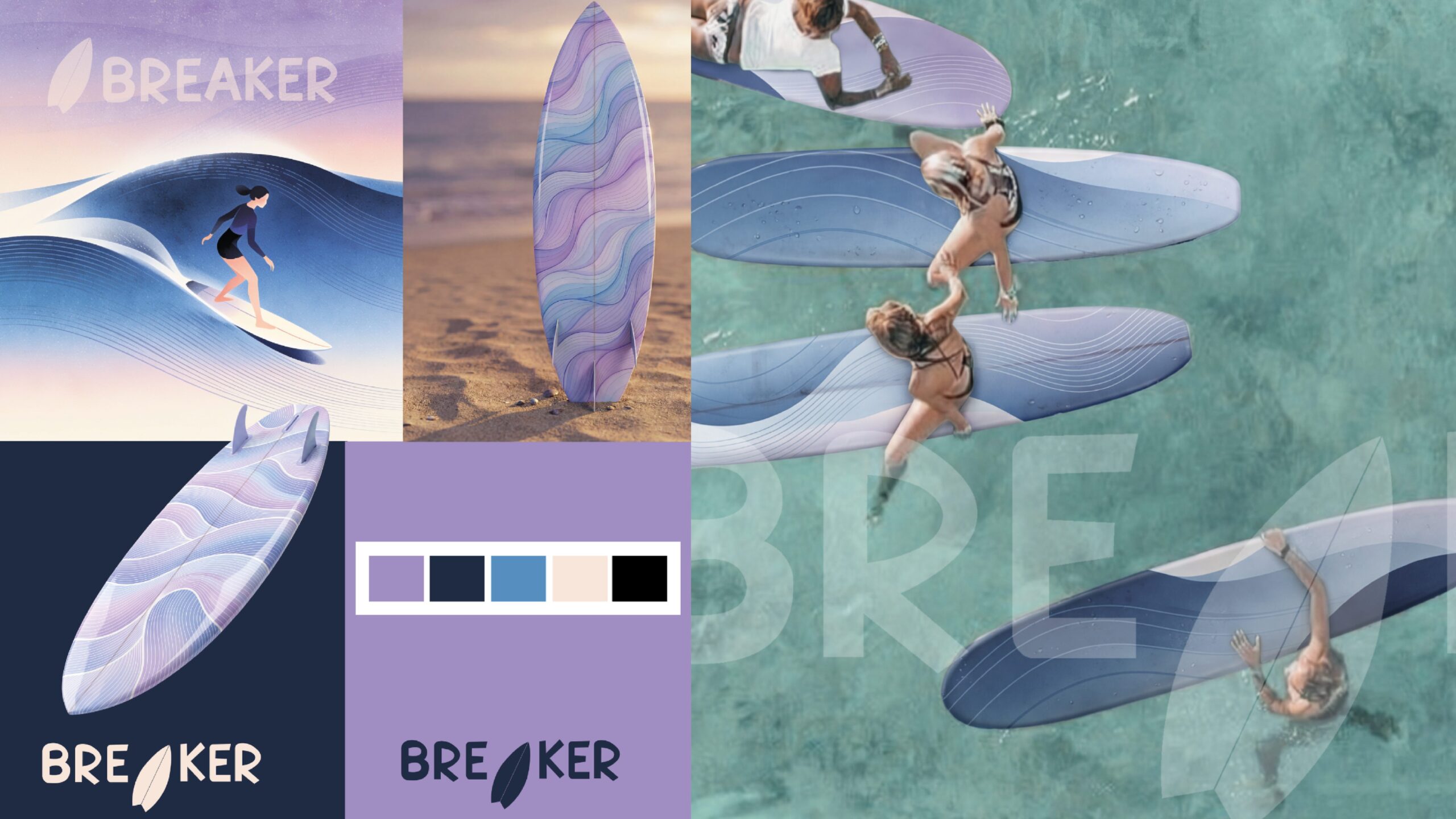
Surf culture has long been dominated by the same visual codes: a certain macho energy, and color palettes that have barely changed in decades, faded blues, sun-bleached oranges, worn-out surf shop aesthetics. This board brand wants to feel welcoming rather than exclusive. The old identity was holding brands like this back because it kept speaking to the same narrow audience, the confident, competitive „bro“ surfer, while ignoring everyone else who just wants to enjoy being in the water. The problem wasn’t the product itself, it was that the visual language of surf culture had never really made room for playfulness, or for anyone who didn’t already fit the stereotype.
BREAKER
Full Visual Identity / Tier 02
Surf culture has long been dominated by the same visual codes: a certain macho energy, and color palettes that have barely changed in decades, faded blues, sun-bleached oranges, worn-out surf shop aesthetics. This board brand wants to feel welcoming rather than exclusive. The old identity was holding brands like this back because it kept speaking to the same narrow audience, the confident, competitive „bro“ surfer, while ignoring everyone else who just wants to enjoy being in the water. The problem wasn’t the product itself, it was that the visual language of surf culture had never really made room for playfulness, or for anyone who didn’t already fit the stereotype.
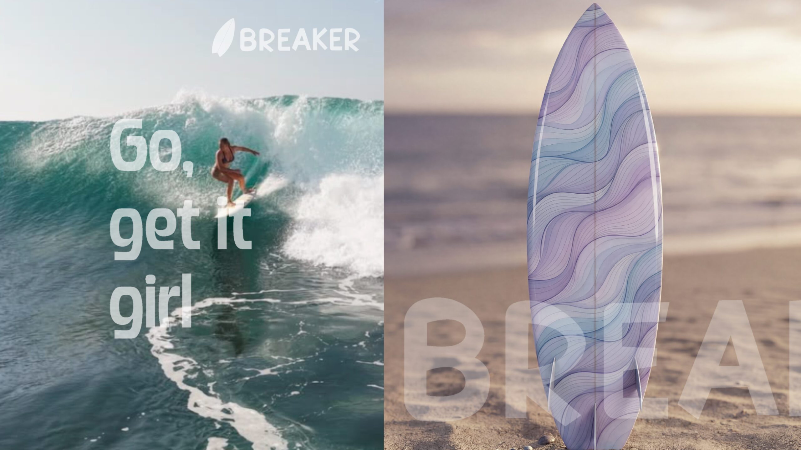
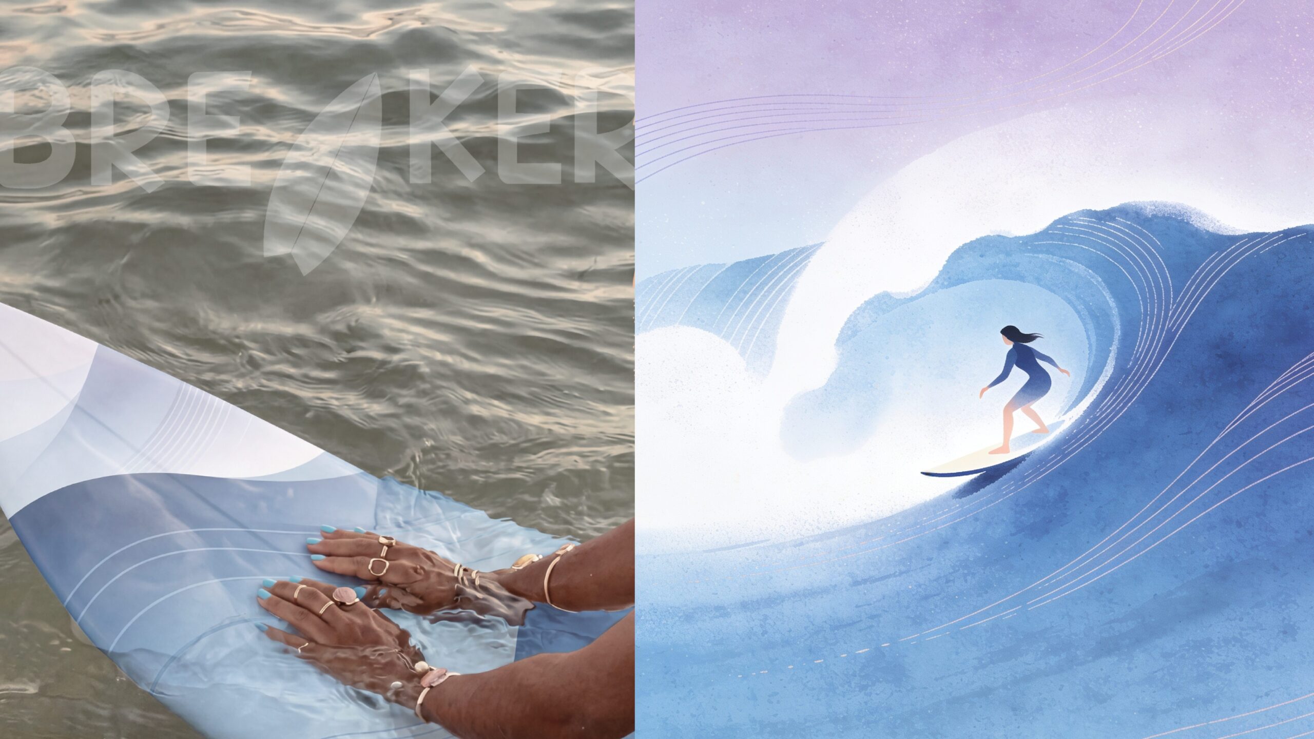
I noticed that nearly every surf brand relies on the same tired palette and a rugged, hyper-masculine tone, which meant there was real space to build something that felt genuinely different rather than just another variation on the theme. That insight shaped the entire direction. Instead of sun-worn oranges and blues, I built the identity around soft lavenders, deep navy, and dusty pink, colors surf culture rarely touches, paired with a dreamy, illustrated wave and a woman confidently riding it. The board designs carry the same flowing, wave-like pattern in that unexpected palette, so the product itself becomes part of the story. Even the logotype, with its hand-drawn, slightly wobbly letterforms and a surfboard replacing the „I,“ keeps the tone playful and human rather than polished and aggressive. Every choice reinforced the same idea: surfing can feel like sunshine and mischief instead of competition.