
TRATTORIA PAOLO
Full Brand Identity / Tier 03
REBRANDING TRATTORIA PAOLO
The restaurant had an identity that felt interchangeable, one that could have belonged to any trattoria in Italy. The old identity no longer reflected what the place was actually about: the island, its history, its symbolism. The issue wasn’t the food or its quality, but that the visual identity failed to make the Sardinian character felt, and that’s exactly what guests are looking for today: origin, character, a story worth remembering.
Trattoria Paolo
Full Brand Identity / Tier 03
REBRANDING TRATTORA PAOLO
The restaurant had an identity that felt interchangeable, one that could have belonged to any trattoria in Italy. The old identity no longer reflected what the place was actually about: the island, its history, its symbolism. The issue wasn’t the food or its quality, but that the visual identity failed to make the Sardinian character felt, and that’s exactly what guests are looking for today: origin, character, a story worth remembering.
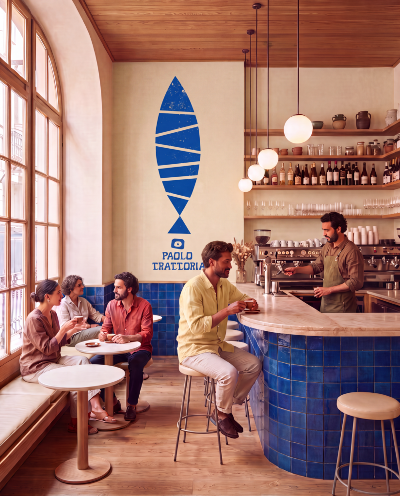
Before designing anything, I researched Sardinian culture, symbolism, and fauna. Four animals kept surfacing throughout that research: the mouflon, the rooster, the tortoise, and the sardine. They’re deeply anchored in Sardinia’s collective visual memory yet barely used consistently as a brand world in the island’s restaurant scene. That was the opportunity: instead of a generic „Italian look,“ build an identity that only makes sense in Sardinia, one instantly recognizable there. This research directly shaped the visual language: illustrations of the four animals running through the island’s colors and geometric patterns, and as the symbol, a reinterpretation of „Su Coccu,“ a traditional Sardinian sign of protection against negative energy. The logotype echoes these same geometric patterns, so wordmark and illustration speak the same visual language.
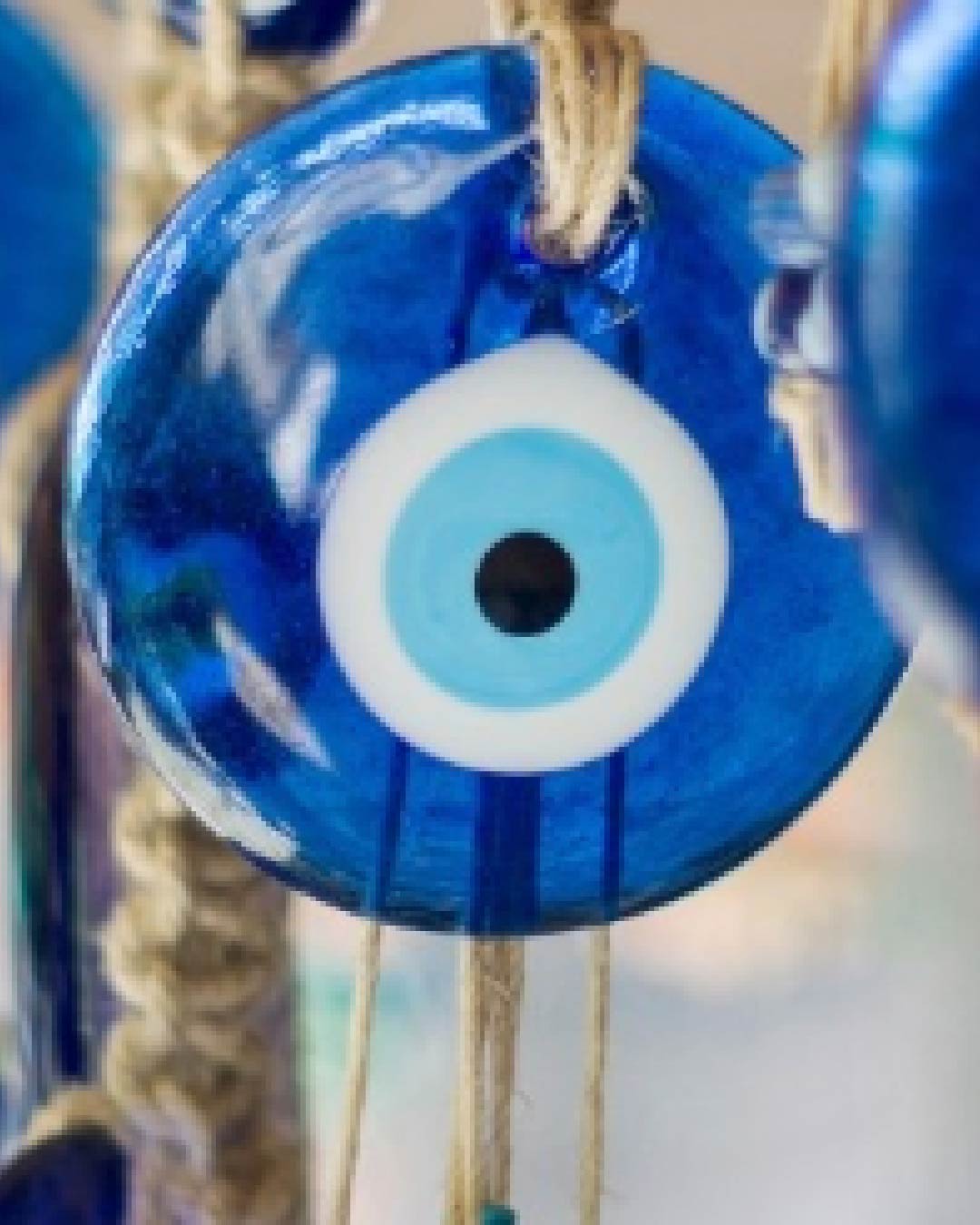
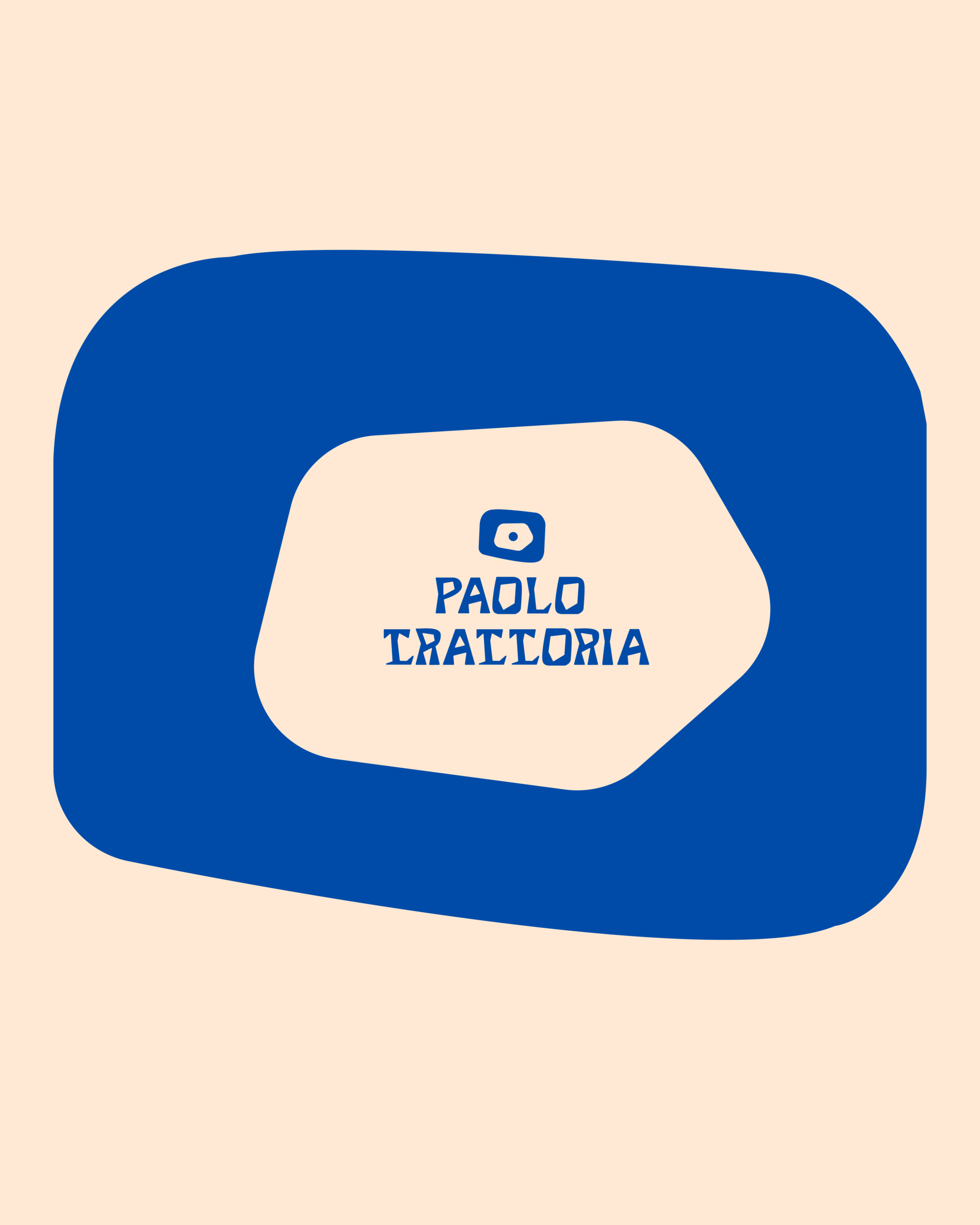
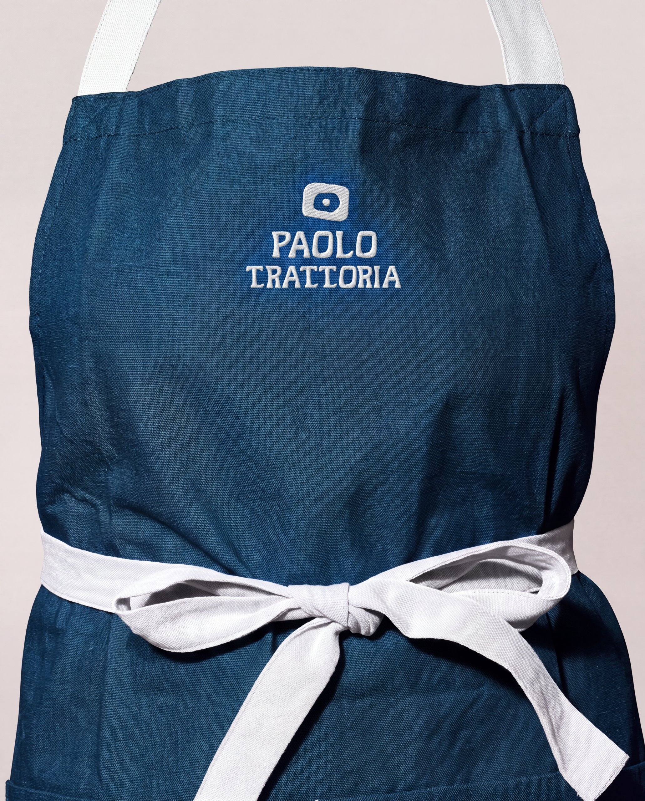
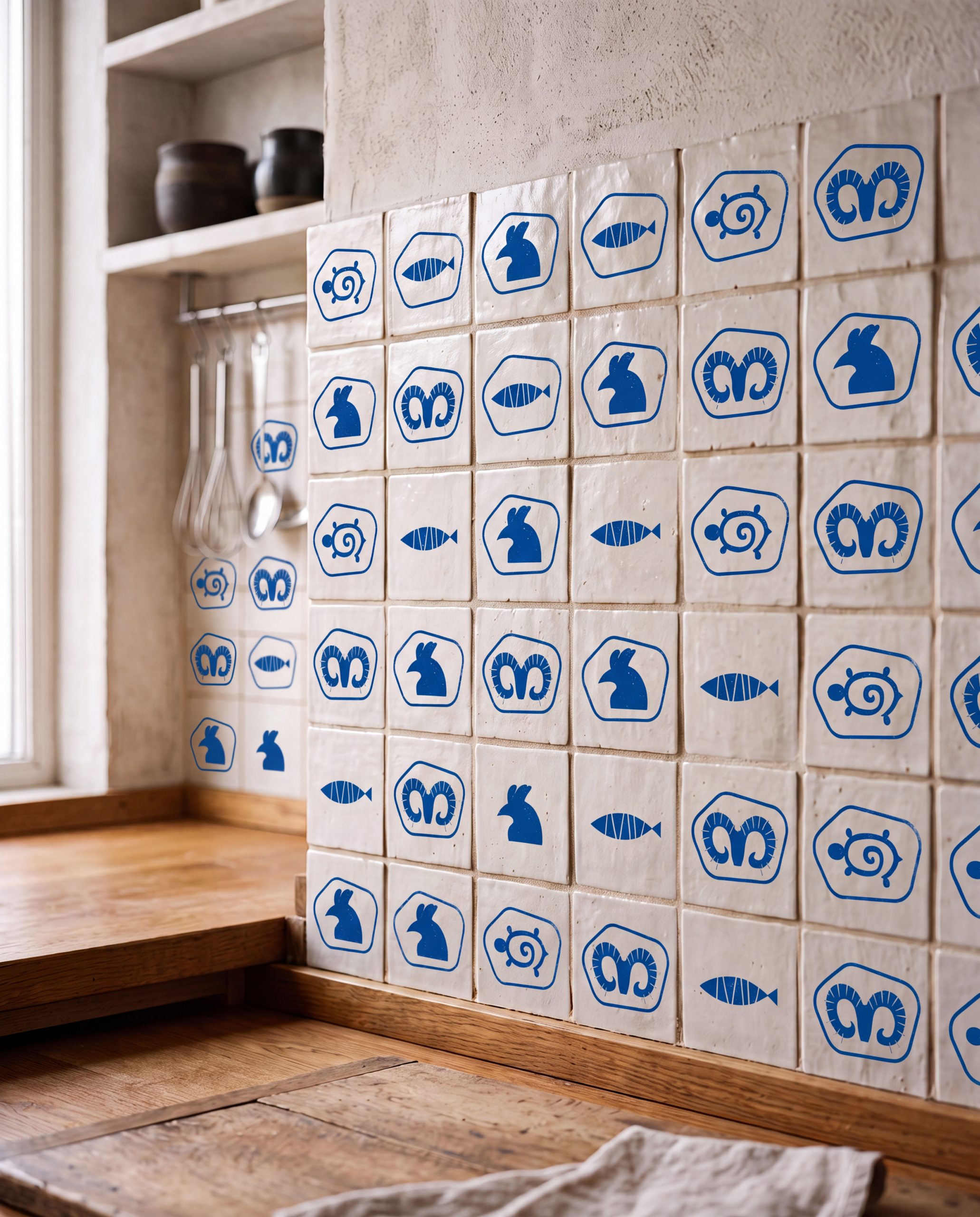
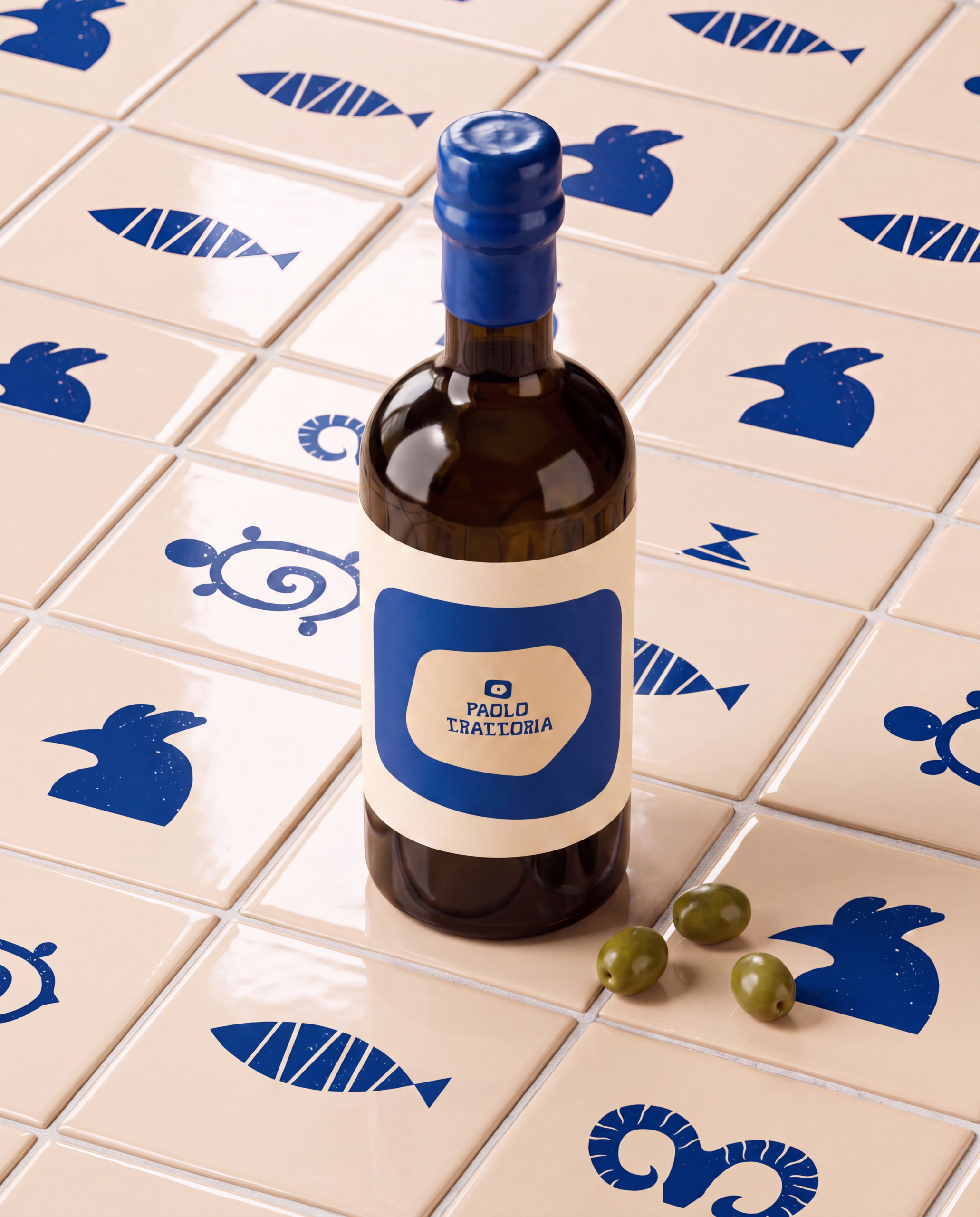
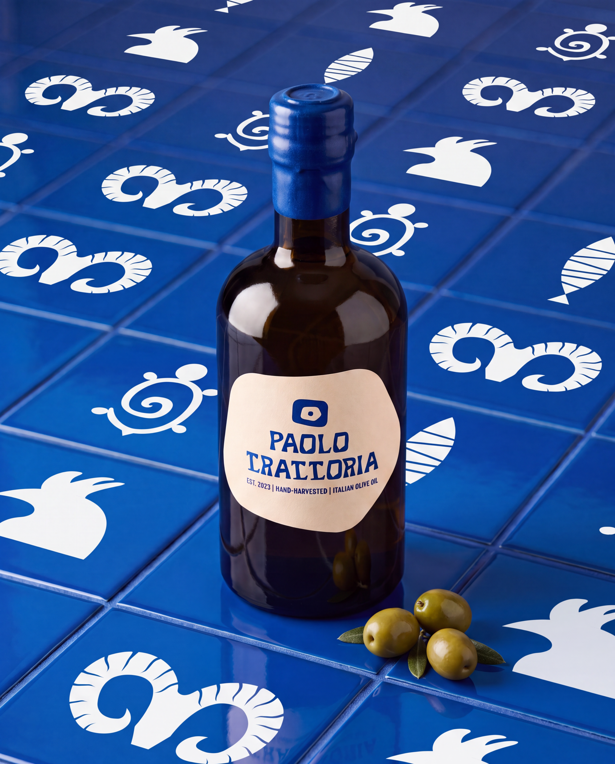
For me, branding doesn’t start at the screen, it starts in the culture a brand comes from. What I look for is the layer beneath clichés. The symbols, animals, and patterns that truly define a region but rarely get translated into brands. „Su Coccu“ is one of those finds, a protective symbol many Sardinians know well, yet one rarely used in design. In the end, a brand shouldn’t just feel „Italian“ or „Mediterranean,“ it should feel inseparable from its place, as if it could only have been born there.