volee
The Full Visual Identity / Tier 02
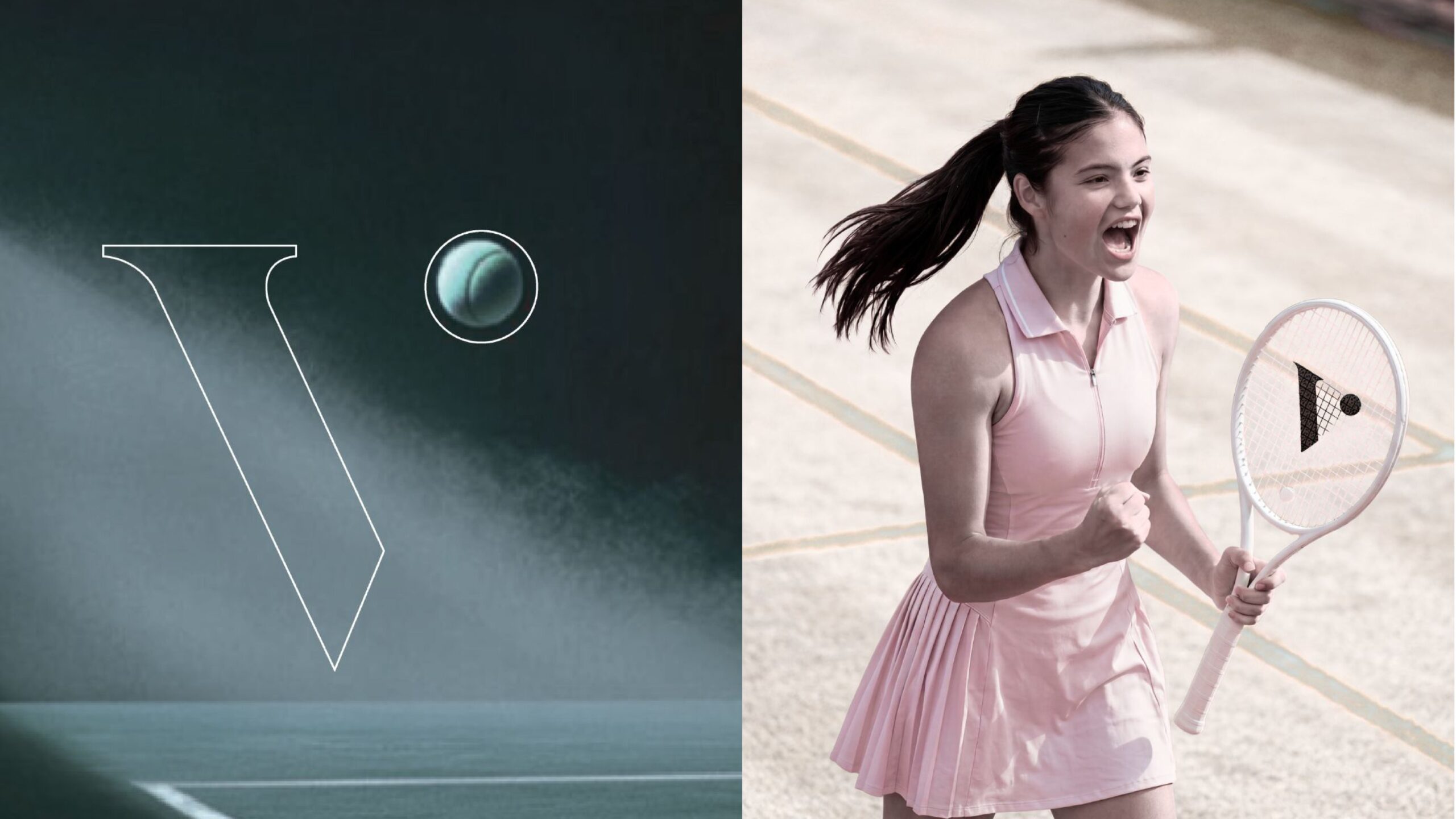
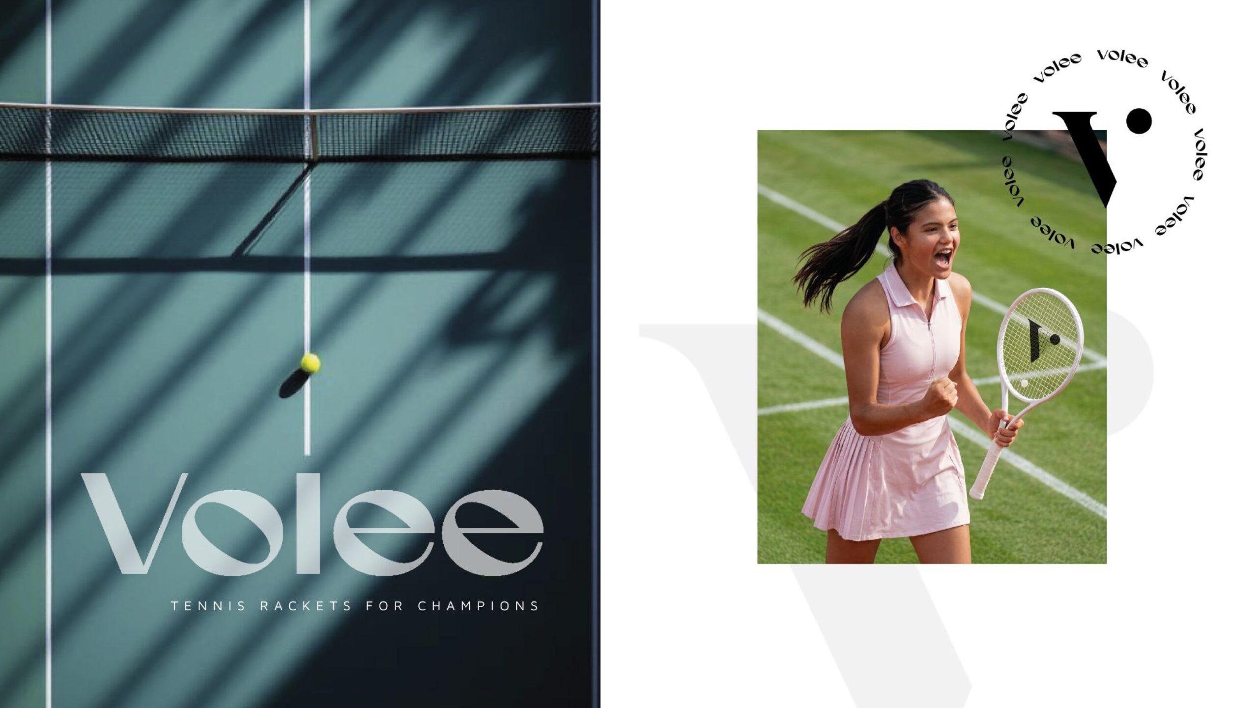
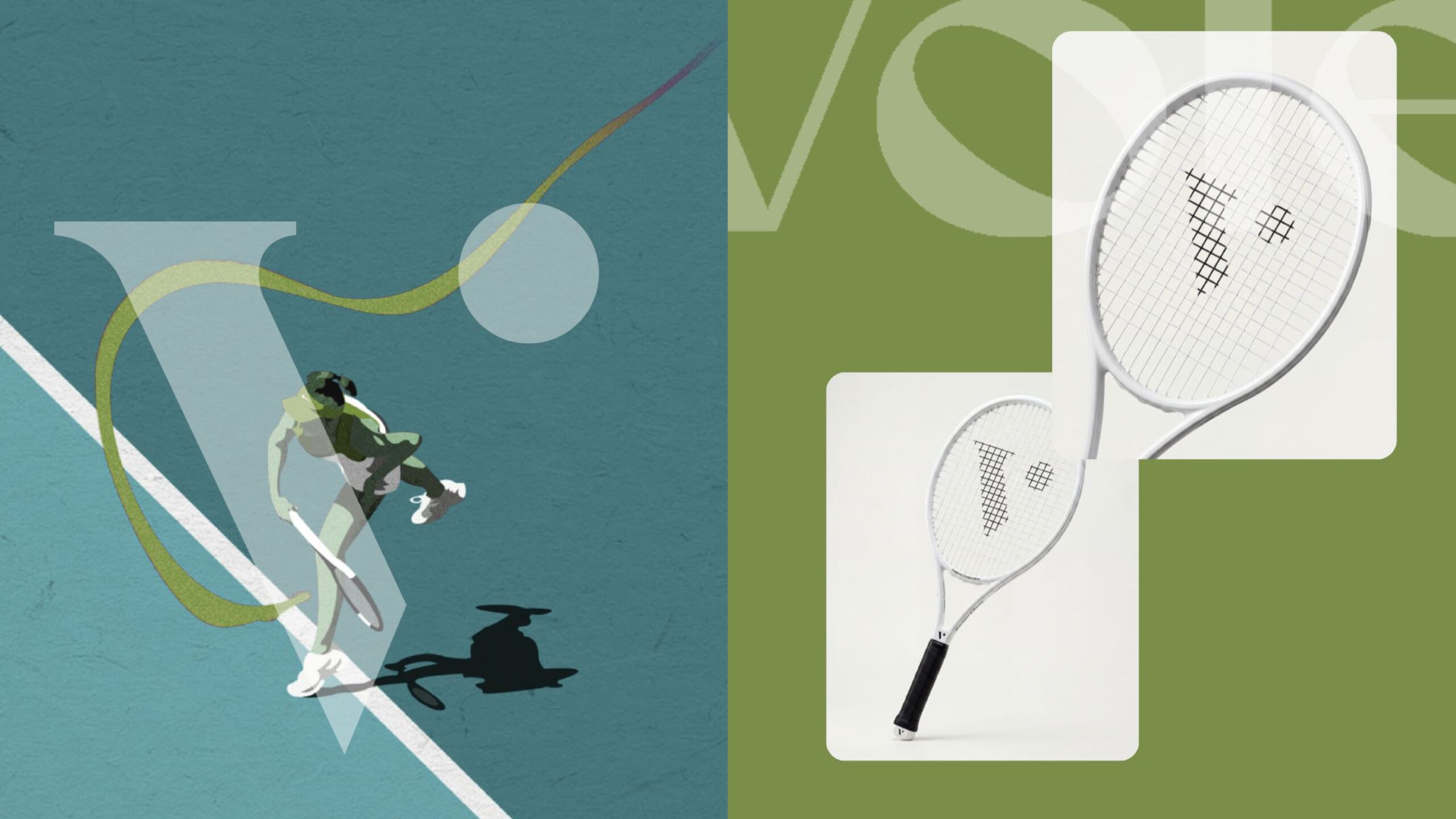
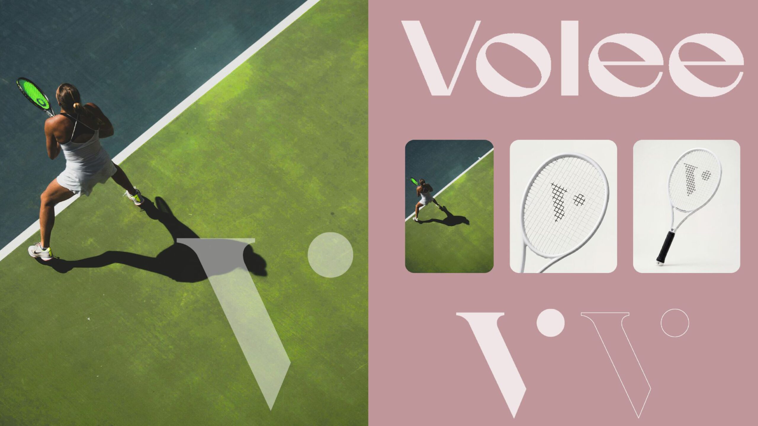
Volee is built around a single idea: a racket in mid-swing, frozen just before contact. That gesture became the logo’s blueprint, an angular V that leans forward with real momentum, paired with a small circle standing in for the ball, a detail that repeats throughout the identity as a kind of visual signature. The typography leans elegant and slightly editorial, tall condensed letterforms that feel more fashion than sportswear, giving the brand a confidence that doesn’t need to shout. I chose a palette of dusty rose and deep misty greens, colors pulled from courtside light rather than the usual neon and black of performance gear. Photography plays with shadow and elevation, aerial shots, fog, soft focus, treating the sport more like a mood than a match.
The Yellow Poppy
Full Visual Identity / Tier 02
Volee is built around a single idea: a racket in mid-swing, frozen just before contact. That gesture became the logo’s blueprint, an angular V that leans forward with real momentum, paired with a small circle standing in for the ball, a detail that repeats throughout the identity as a kind of visual signature. The typography leans elegant and slightly editorial, tall condensed letterforms that feel more fashion than sportswear, giving the brand a confidence that doesn’t need to shout. I chose a palette of dusty rose and deep misty greens, colors pulled from courtside light rather than the usual neon and black of performance gear. Photography plays with shadow and elevation, aerial shots, fog, soft focus, treating the sport more like a mood than a match.